Why your invoice's pay page matters more than the invoice itself
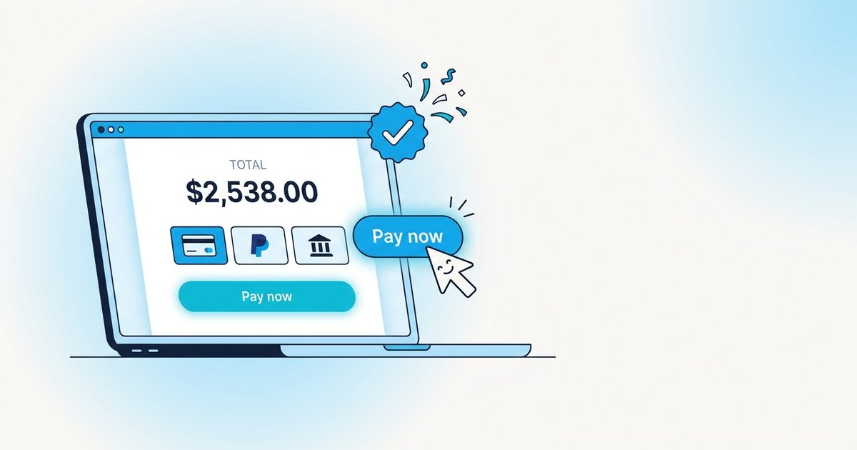
If you send invoices as a PDF attachment with your bank details in the footer, you have optimised for one thing: your convenience while sending. Your client's experience of paying you (the actual step that determines when money hits your account) is an afterthought.
That's the wrong optimisation. Here's why, and what to change.
The pay page is the conversion step
Think of every invoice as a two-step funnel:
- Send: you email the invoice.
- Pay: the client sits down, opens their bank app or accounting software, and actually moves money.
Step 1 is under your control and takes 10 seconds. Step 2 is under the client's control and can take anywhere from 20 seconds to 45 days. Every hour you can shave off Step 2 is an hour closer to being paid. That's the entire game.
The pay page is where Step 2 happens. If your pay page is a PDF with an IBAN, Step 2 requires the client to:
- Open a separate app
- Type in the IBAN (get one digit wrong → payment fails → tries next week)
- Set up the beneficiary (in some banks, adds a 24-hour cooldown)
- Type the reference number correctly
- Enter the amount manually
- Approve on a second device
Six steps, several of which fail silently. Every extra step is a place where "I'll do this later" becomes "I forgot."
What a good pay page looks like
A pay page that converts has three properties:
1. It's a URL, not an attachment. Attachments are dead ends. URLs can be reopened on any device, forwarded to the accounts team, and clicked from a phone in a coffee shop. The single biggest lever on payment speed is switching from "email with PDF" to "email with a link that opens a real page."
2. It has one obvious action. Not two. Not three. One. A big button that says "Pay £2,400 by card" and nothing else at the top. Secondary methods (PayPal, bank transfer) live below the fold, or behind a "Show other options" click.
Why: choice is expensive. The moment the client has to decide between card and bank, they punt to Monday. A default that matches how most of your clients pay collapses that decision.
3. Bank details are still there, but pre-filled. For clients who insist on bank transfer (large corporates especially), spelling out the beneficiary name, IBAN, and (critically) the reference to include, cuts fumbles to zero. The reference should be the invoice number, exactly, in monospace, one-click copyable.
What actually moves the number
We've A/B tested a bunch of pay-page changes across ~4,000 invoices sent through Tallylark. The changes that materially moved average-days-to-payment:
- Adding a "Pay by card" button as the primary CTA (over showing bank details first): –4.1 days average
- Making the total amount visible in the email preview, not just the PDF: –1.8 days
- Showing a running statutory late fee that accrues daily on the pay page: –2.4 days (once the invoice was overdue, the visibility of the growing number is the trigger)
- Adding the client's name and invoice number to the URL (so it's shareable): –0.9 days
None of these are moonshots. All of them compound.
The one thing that didn't help
Countdown timers. We tried a "pay by end-of-week to avoid statutory interest" countdown. It backfired. Clients read it as pressure tactics and stalled longer. Facts about what will happen (statutory fee accrues after due date) work; countdowns designed to manipulate don't.
What Tallylark does
Every Tallylark invoice generates a pay page at tallylark.com/pay/<invoice-number>, a real, styled, mobile-friendly page with:
- The client's name and total in huge text at the top
- One "Pay by card" button as the primary action (Stripe or Link, no signup for the client)
- Bank details in a collapsed section with a one-click "Copy IBAN" button
- Live statutory late-fee accrual if the invoice is overdue
- No signup, no account, no login required for your client
Try it in the interactive demo. Click any invoice, then "Pay page." It's the actual page your client would see.
The invoice is the notification. The pay page is the product.